Vento: A Product Design Case Study
Creating and validating a digital experience for a Tokyo food concept
ROLE
UX / UI Designer
CLIENT
Independent project.
SOFTWARE
Figma, Adobe Illustrator, Adobe Photoshop
LANGUAGE
Tokyo, Japan · 2021
English
Creating a new app to help foreign people in Tokyo who can't speak or read Japanese to find vegetarian/vegan lunchboxes nearby - in a hypothetical food chain called Vento - during peak hours. Before launching, I need to figure out if finding this service is easy for users to do. I’d like to understand what specific challenges our users might face in the ordering, payment, and searching process, and how we can help them fix those challenges.

IN A NUTSHELL
CHALLENGE
PROJECT INTRODUCTION
Motivation
I have lived in Tokyo since 2018 and - as a foreigner - one of my biggest problems used to be the language. Like many other people, I want to be able to order some takeaway lunches easier and faster when I am on the go.
In Japan, there is a very typical and traditional type of takeaway food called 弁当 o べんとう (bentō). It is very common to see Japanese people carrying lunchboxes prepared at home or bought in stores that are specialized for this. The problem does not reside in the preparation of these at home, since those tend to be of better quality and someone who has the time to prepare one on their own might not need to search outside. But for those who do not have time (or very small kitchens to prepare large amounts of food), I have always seen several problems (especially for foreigners who live here with a somewhat limited level of Japanese) with something very convenient in a city with such a hectic pace:
-
It is difficult to find stores that specialize in making bento or restaurants with take-out options near you just by using your smartphone.
-
The best stores, those where you walk in, take a lunchbox, and fill it with the food you prefer, are difficult to locate in English.
-
A lot of plastic is used in this type of establishment, and in general everywhere. Japanese society is not very friendly to recyclable or reusable products. These are also not made out of good quality materials and you might find yourself spilling a lot of the content out of the lunchbox.
-
Lack of vegetarian options or difficulty finding them, if there are any.


USABILITY TESTING
Testing Framework & Methodology
KPI's used
-
Time on task: How long it takes a user to complete a task
-
Drop-off rates: The number of users who give up without accomplishing their goal
-
Conversion rates: The number of users who reach their goal successfully
Research Setup
-
Unmoderated usability study
-
Location: Tokyo (Japan), remote (each participant went through the usability study in their own home)
-
Date: May of 2021.
-
Five participants, each completing the study on their own.
-
Each session will last 60 minutes and will include an introduction, a list of tasks, and a short questionnaire.
RESEARCH
Understanding the users
Research Process
I conducted guerrilla usability testing to understand the problems the initial rough design could have. During the synthesize phase, I used affinity mapping to analyze pain points and determine priorities. Then I generated task flows to understand where in the process users were having trouble and created Lo-Fi sketches and Hi-Fi clickable prototypes.
Key Research Questions
-
How long does it take for a user to find or order a lunch box in the app?
-
Are there any parts where users are getting stuck?
-
Combinations of services the user can make (order only, customization and pick up, finding a store, etc.).
-
Does the user find it helpful versus all the already existing Japanese options?
Participant Profile
-
Foreign residents living in Japan (short-term or long-term)
-
Busy individuals who need quick lunch options nearby
-
Non-native Japanese speakers (Japanese fluency not required)
-
Ages 20–35
-
Both native and non-native English speakers
-
Participants not required to be vegan or vegetarian
USABILITY TESTING
User Persona
To help communicate information about users, I created a provisional persona and used it as an example for structuring the problem she goes through when trying to find a place to eat during lunchtime.

IDENTIFYING THE PAIN POINTS
Journey Map

User Journey
To better understand the user journey, I developed task flows outlining the steps users would take to find a nearby shop and order a customized lunch box through checkout.

DESIGN PHASE
Prototyping
During the design phase, I first created a low-fidelity prototype without colors or branding elements to focus solely on testing interactions and core user flows. After conducting usability testing and analyzing the insights, I iterated on the design and developed the final high-fidelity mockups and interactive prototype.


Key Findings from Low-Fidelity Testing
-
It was observed that 3 out of 5 subjects had trouble understanding names in Japanese for some ingredients. This means that the Japanese language is the main barrier that motivates to create this app, and can't take for guaranteed that everyone understands the names of Japanese ingredients (should include an English translation if possible).
-
It was observed that 2 out of 5 subjects are familiar with ''custom product'' features. This means that for most users, it’s not immediately clear how to customize a product. Only 1 out of 5 have trouble changing the ingredients in that section.
-
It was observed that 3 out of 5 subjects have trouble finding information about allergens or vegan/vegetarian suitability of products. This means that information about this has to be clear for every user since it's one of the most important features of the app.
Key Themes
-
Based on the theme that for most users, the language is the biggest barrier, an insight is: that anything that has a Japanese name has to be translated or shown with a hint (image or illustration).
-
Based on the theme that it's not immediately clear that users know how to identify or fully use a custom product feature, an insight is: show a hint or step-by-step help process at least one time or when the users are using this feature is for the first time.
-
Based on the theme that the majority of the user is going to be vegetarian/vegan or have some sort of allergen issue, an insight is: information about these top should be one of the first information points they see when displaying products or ingredients.
Moodboard & branding references

Style Guide


Refined High-Fidelity Prototype & Mockups


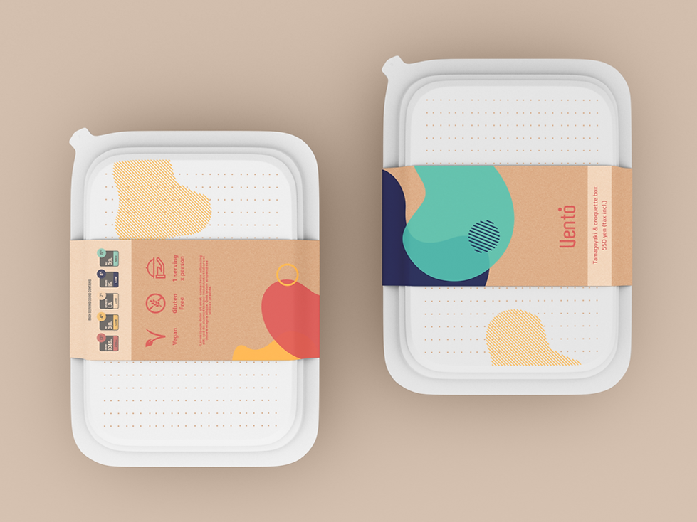
Concept Packaging Design